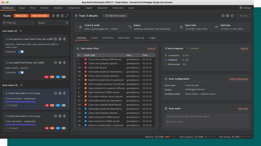
Burp Suite Pro dashboard
Problem: Burp Suite Professional's dashboard was complex and overwhelming to users, and didn't surface the power of the scanner.
Role: UX/UI Designer
Duration: 2 months
Challenges
Users were not aware of the power of the scanner in Burp Suite Pro, nor it’s capability. A number of initiatives were undertaken to bring the capability to the forefront of Burp Suite Professional.
With this in mind the new initiatives were not reflected in the dashboard, causing us to ask the question is the dashboard fit for purpose.
Defining the problem space
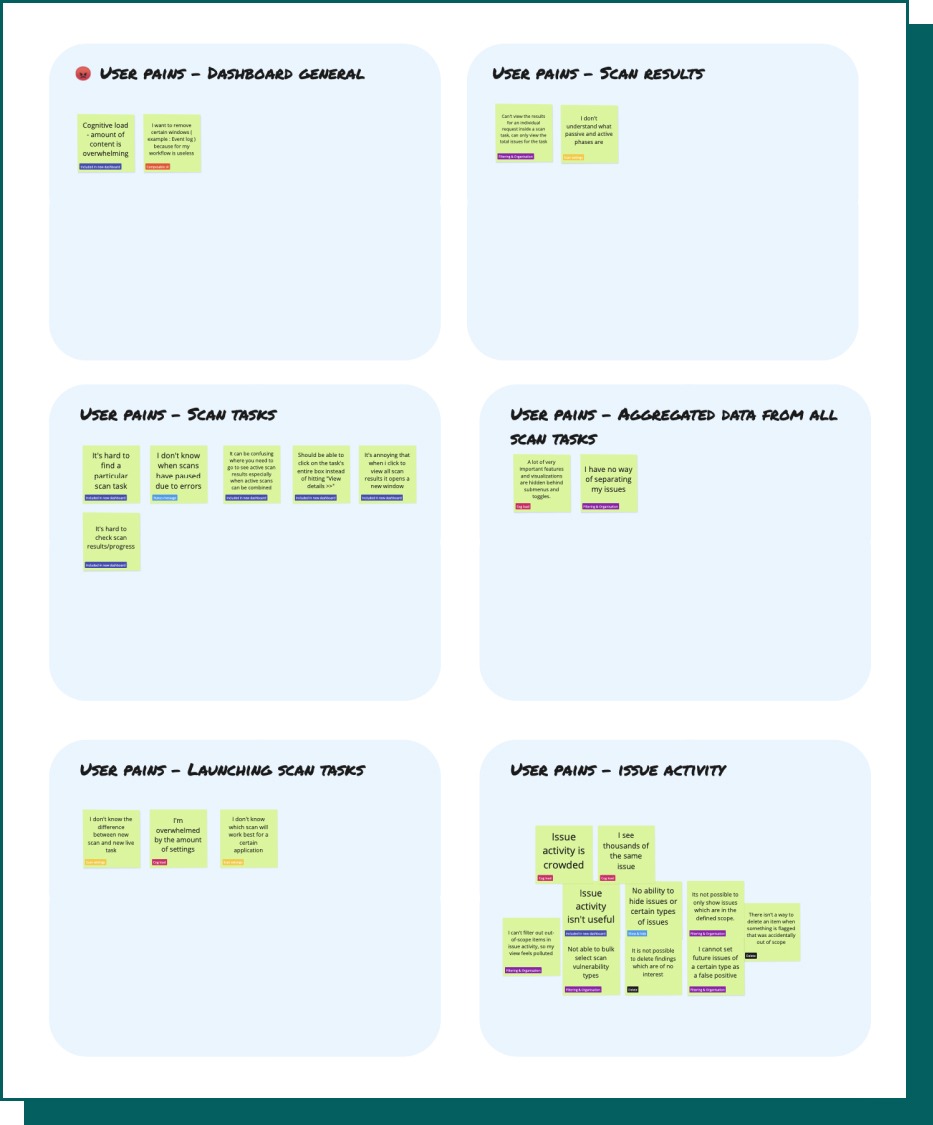
To initiate the work within the dashboard, we sent out an initial survey to users to understand how they currently use the dashboard, we asked users a number of truth statements with space for additional feedback.
We also worked closely with Tech Support to collect cases from where users have encountered pains with the dashboard
The initial results from the survey gave us a baseline to measure against for the success of the new dashboard.
Groupings were also created from additional feedback and comments given within the survey, giving us 3 key areas of focus and user pains.
Solution exploration
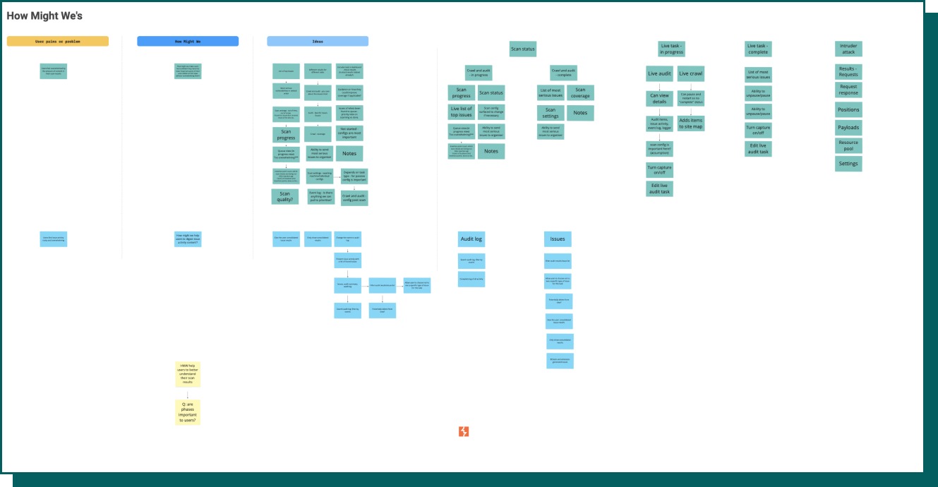
From the user pains we created two How Might We questions that encapsulated the user pains.
We ran a workshop with Scanner developers and Tech support to ideate on both statements.
"How might we make users feel confident they have the most important parts of their scan visible on first view without overwhelming them?"
"How might we help users to digest issue activity content?"
Miro board of HMW workshop
Initial designs
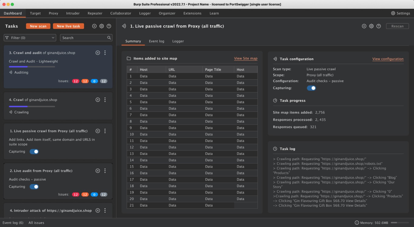
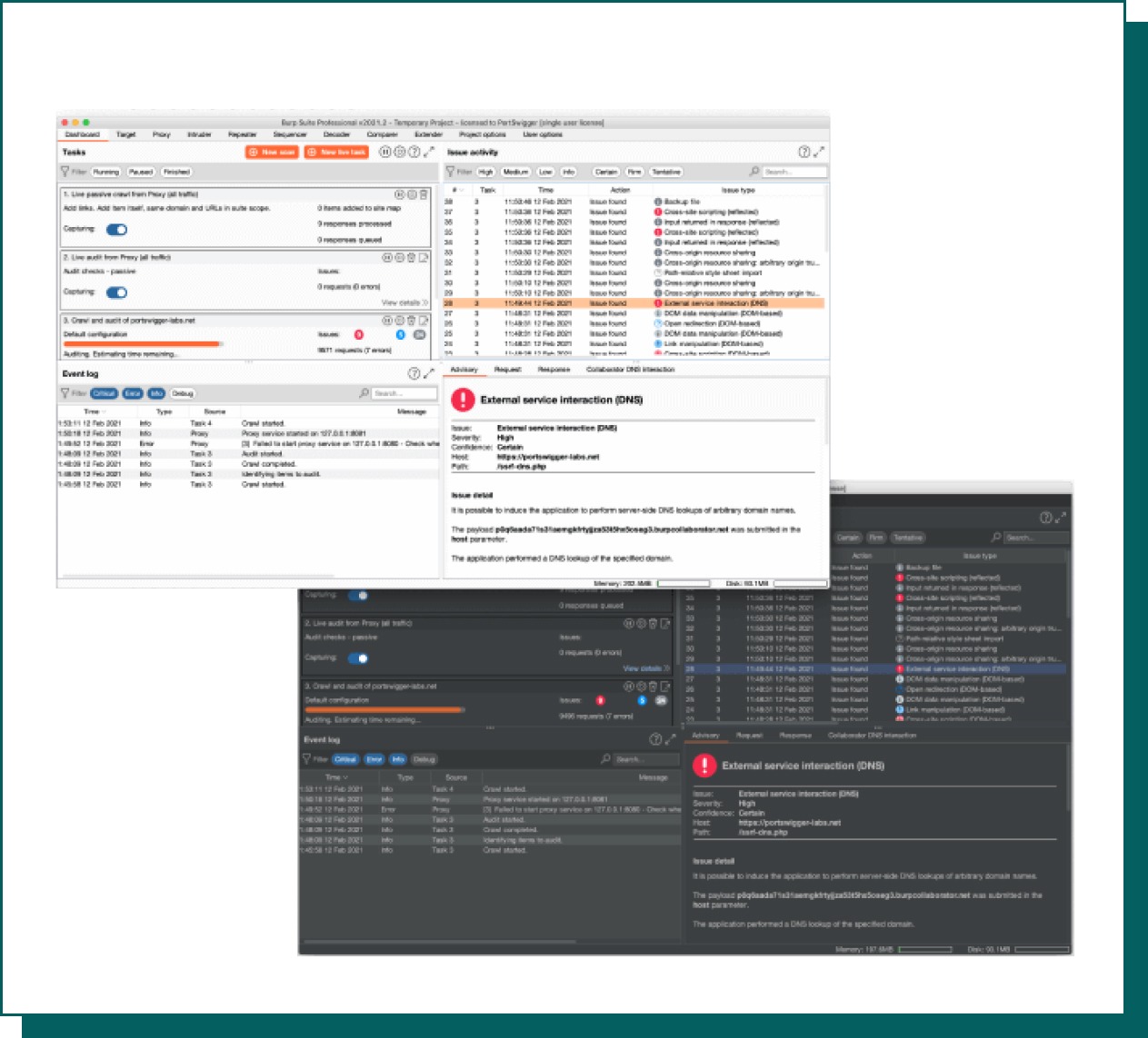
The previous dashboard has scan task details hidden, users would have to click multiple times to view the results of their scan, even after clicking scan results would open in a new window.
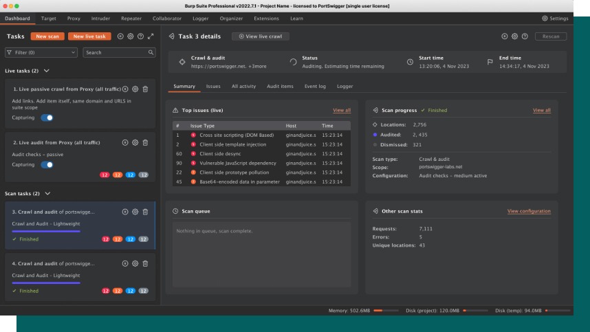
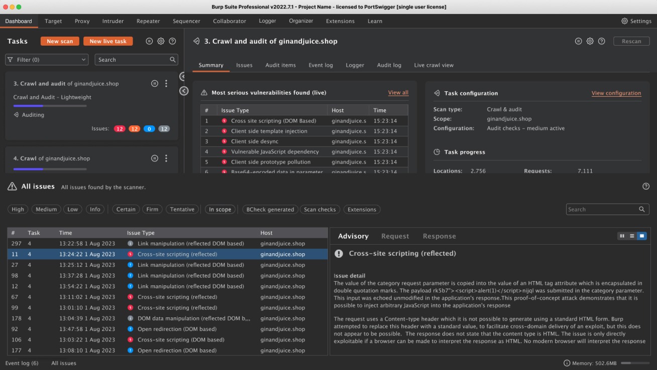
The improvement we felt confident in was arranging the scan tasks into a side bar to make them easily accessible for the user to view and interact with, and be able to keep them in the window.
We ideated on what the first view should be when users click on a task, what we believed would be of value to a user and what information was most important to them. For example allowing the user to take notes on the scan, the ability to see the progress of the scan, what tasks were specifically being undertaken, or various progress statistics.
Examples of ideation
Designs tested

Change overview
Visibility of scan tasks
Issue activity being difficult to navigate
The dashboard feeling overwhelming
User testing
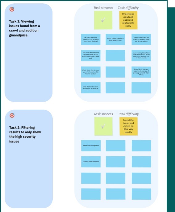
We tested a prototype with five Burp Suite Pro users, the aim of this testing was to see if they could continue to successfully carry out their day to day tasks using the new dashboard, and to gather any additional feedback.
To do this we gave users a set of tasks to complete whilst monitoring their activity.
We then asked them truth statements on their perception of the new dashboard, and any additional comments they wished to add.
All users successfully completed the given tasks.
What went live
Burp Suite has a wide fan base, to aid what would be quite a significant change, we recorded a YouTube Short to illustrate the changes made.
Feedback & next steps
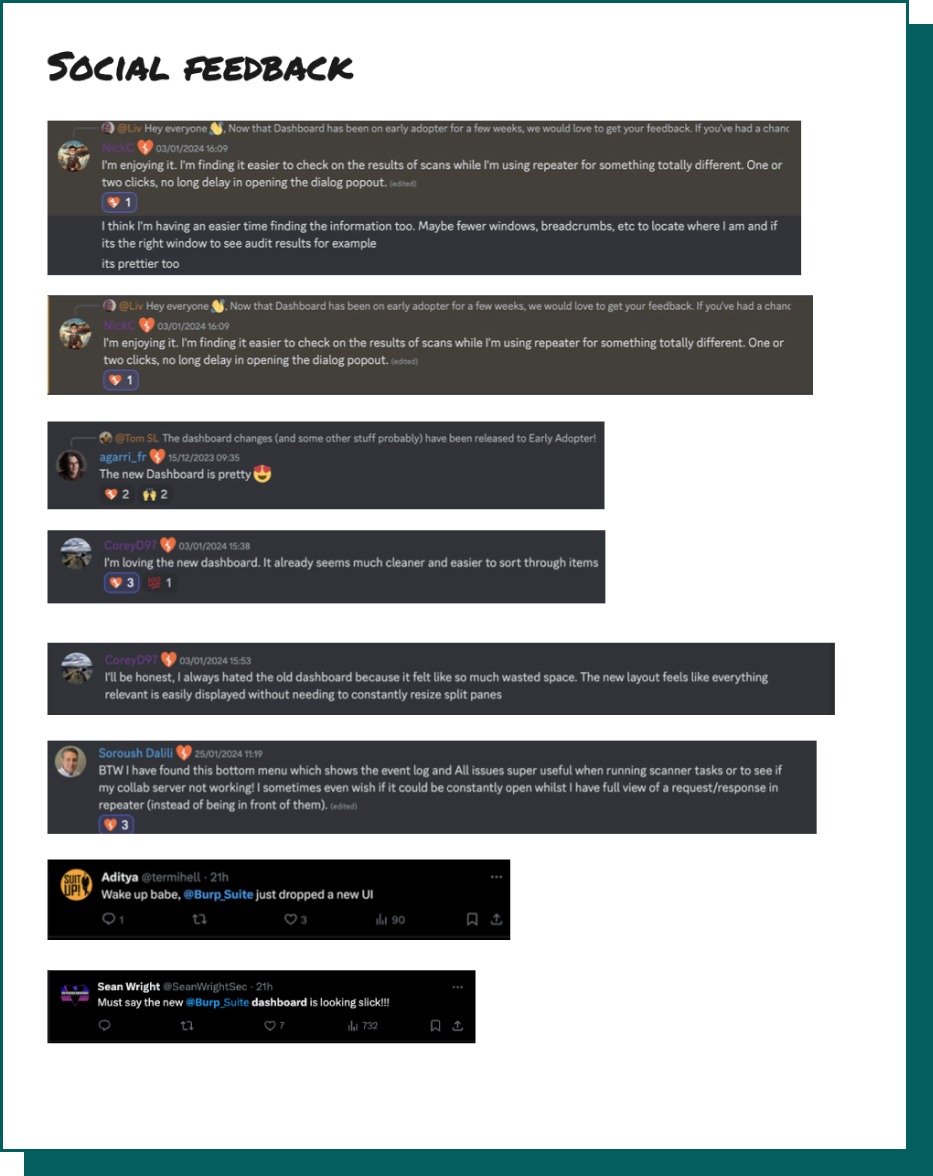
We relied heavily on early adopter feedback for this feature, at the time we had also just launched a Discord channel, so we got the question out to users to provide us with feedback as soon as possible.
Once dashboard had gone live on stable we also collected anecdotal feedback on X and Discord.
We continued to monitor tech support for any user pains.
The feedback we gained was largely positive with users stating it was less overwhelming and easier to use.
With having a benchmark number from the initial survey, the future plans were to rerun this survey 4 months after launch to give users an opportunity to onboard with the new features.
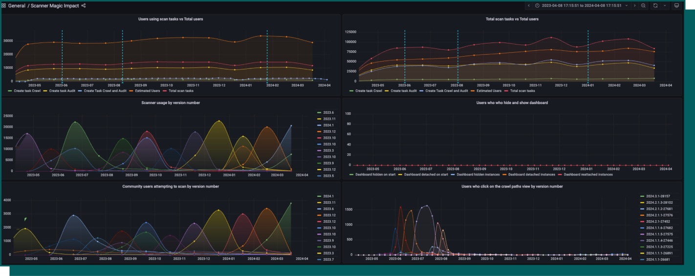
We added telemetry into a lot of the different points of the dashboard this enabled me to create a Grafana dashboard to measure the impact the new dashboard had on number of scans being run.
Release of the dashboard saw an uptake of users running scans by 1.3%.