Gravity design system
Problem: The Hut Group owns and runs over one hundred sites, all with inconsistent components and varied designs. Maintaining such a large number of sites with no set guidelines was costly and time consuming to the business.
Role: Research, UX/UI Design
Challenges
THG is in a unique position for the implementation of a design system. The platform is built to rapidly scale hundreds of brands across multiple locales, and the design system needed to support all edge cases.
This was taken into consideration when defining the principles of the design system
Principles
Design for a everyone
Accessibility is at the heart of Gravity, every user must be able to use a THG site. The THG platform is global, so all users must be taken into consideration.
Start with user needs
We can only make the right design decisions when we know what the user needs are. When we have our solution it’s effectiveness needs verifying against it’s goal. Not only by our user on the outside, but also our internal users: UX designers, traders and brand designers.
Be consistent
Consistency helps the user by creating familiarity and strengthens intuition. For our design and development teams, it creates efficiencies in our processes.
Collaborate and share
We need to share the progress of Gravity with everybody; the wider UX team, developers, traders, and brand designers. Ask for their feedback, their ideas and their pain points. Gaining perspectives from different disciplines will highlight areas for improvement and inspire innovation.
Design process
Research
Benchmarking against other successful design systems, auditing current platform challenges, researching commonly used patterns and best practice.
Design
Designing against set principles.
Test and iterate
Stress testing the design, user testing with designers.
Define and document
Create spec sheets for developers, integrate into sketch libraries, define guidelines and usage on Design System Manager.
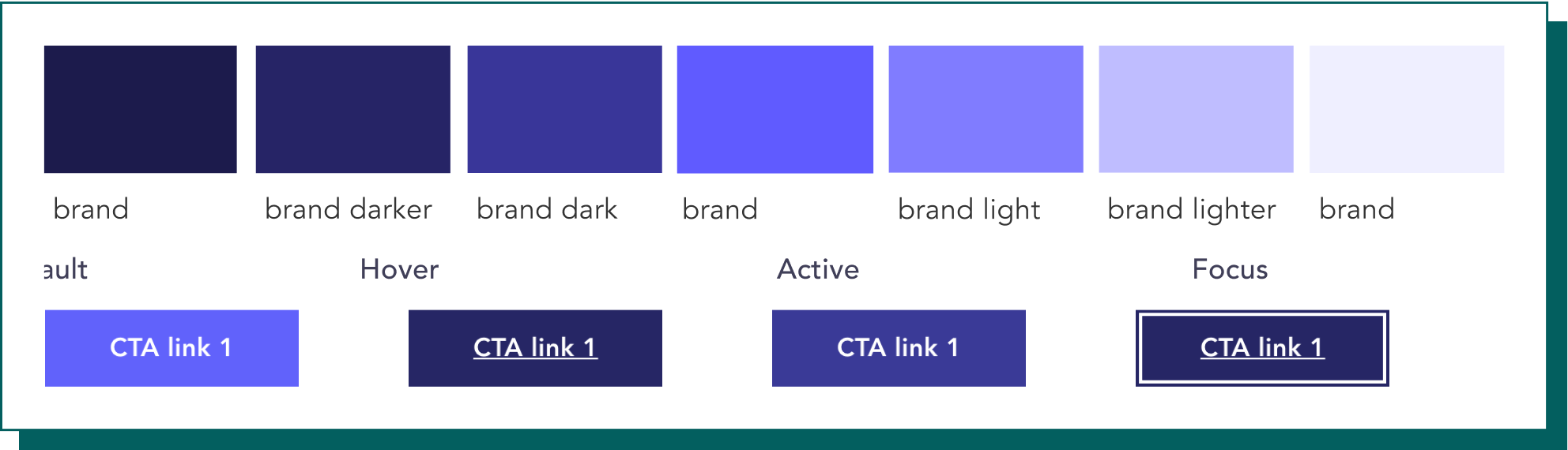
Key Highlight | Colour
The brand scale was introduced to add flexibility and interaction to the UI of any brand site, brands can have up to three brand colours: Primary, Secondary and Tertiary.
Tints and shades have been introduced to brand colours to enable interaction within the UI and place emphasis on the colour used.
There is no set usage guideline for colour scales thus far within the Gravity guidelines, the best way to outline the flexibility of colours is through the example of a high emphasis button in it’s different states:
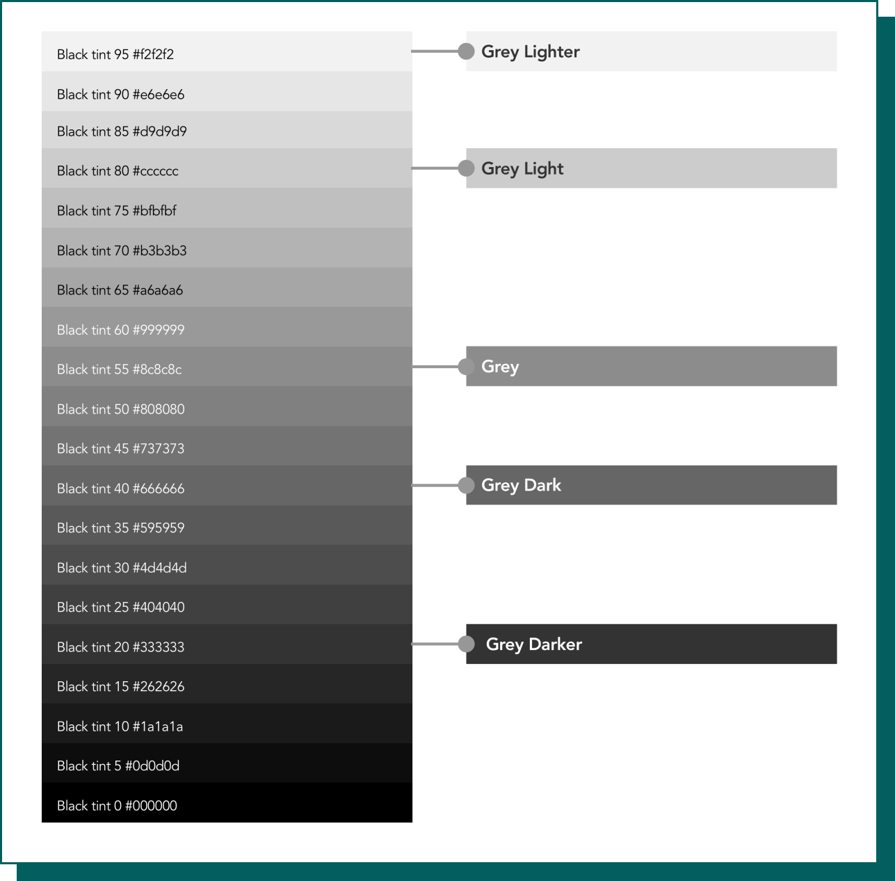
Key Highlight | Grey scale
The grey palette was developed by auditing and assessing colour usage across all sites on the platform and finding common colours that would be used intentionally and have a clear purpose.
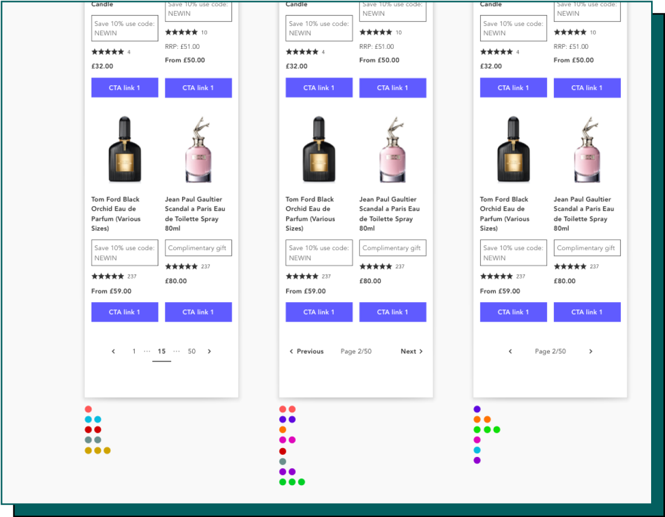
Component ideation
To create new components, I have taken the existing components and researched best practice and common patterns.
These have then been iterated through lo-fi sketches and designs, and rapid feedback gained through dot voting.
Implementation
Sketch UI toolkit
A responsive UI toolkit was created in sketch for designers to rapidly build consistent and accurate prototypes.
Design system manager
An Invision DSM created to outline supporting documentation, aiding designers in getting started to use the toolkit.
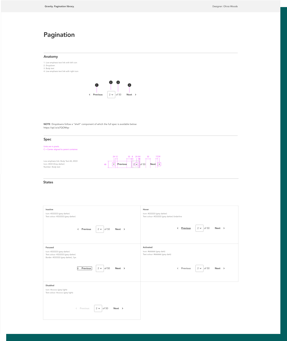
Component specs
As a way of maintaining consistency between designer and developer, we created specs for the developers to use when creating components.
These specs are a comprehensive guide to any component, outlining any states and edge cases that may occur during use of the component.
Specifications have been key to gaining developer buy in and building relationships between the teams.
Outcome and next steps
Outcome
• The Gravity Design System has had an overwhelmingly positive effect on both UX designers and developers.
• It has enabled designers to prototype at speed to a high standard with the knowledge all components used have been thoroughly researched.
• It has enabled developers to componentise the new platform with clear guidelines.
Next steps
The Gravity Design System is being designed alongside a new platform rollout, the next steps are:
• To introduce new components where found on the platform and implement through the same research and development process
• Continue to support designers in contributing to the design system, raising design standards throughout the team